…Unless you include pretty pictures!
Many organizations use infographics to tell their important data, because that’s the only way they can get people to actually pay attention. If done successfully, infographics are an awesome tool for organizations that use a lot of numbers and data to sell their product or raise awareness about something. Data is (obviously) important — it tells us how society behaves in a million different ways.
The problem with data is that, unless someone is purposefully looking for it, no one wants to read it. It’s usually boring, or explained in a way that’s hard for people to understand. And, with the rise of technology — with which we are constantly being bombarded by information — and increasingly short attention spans, it can be hard to get people to pay attention.
I mean, seriously, guys. Studies show that humans have an average attention span of eight seconds. That is a big yikes for companies who want your attention.
National organizations like the American Heart Association (AHA) are big on numbers. Being skilled at creating infographics is important for them. The AHA uses them to inform the public about a lot of important data, and they are quite successful at it.
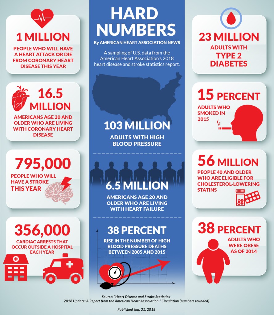
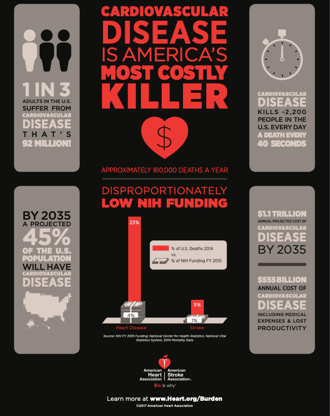
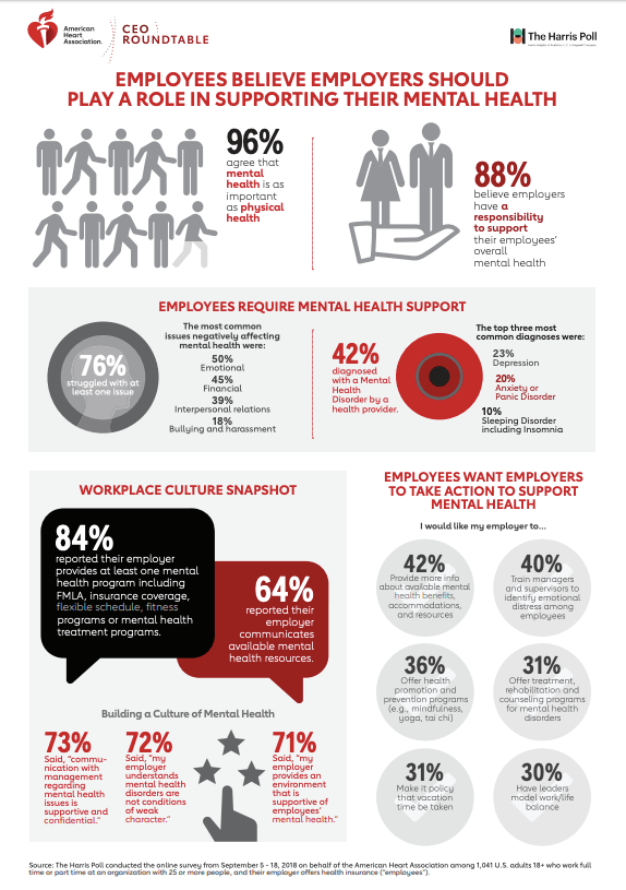
Pretty good, right? They have an entire page on their site dedicated to their infographics. Check it out here.
Infographics allow AHA to include visuals, nice color schemes, and design to otherwise dull (but significant) data. This is also something that I’m 99.9% sure AHA will send to hospitals and other partners to use as posters in their clinics. Something like this is far more eye-catching than a piece of paper with printed numbers on it in 12-point Times New Roman font.
The pros of using infographics?
- If they look nice enough, they will make your organization look more professional.
- They can be memorable.
- They will attract people to read and understand your important information.
- They will attract new audiences.
What is this — using infographics — called?
STRATEGIC COMMUNICATION!
Woot woot! That’s what PR is all about. AHA is trying to communicate their data with old and new audiences through the strategic use of aesthetically pleasing visuals.
So, next time you see an infographic that catches your eye in the school hallway, on TV, or on your local bulletin board, you’ll know what that company is doing. And, you can give them an imaginary high-five for being successful at causing you to stop and look for a moment.
