Hospitals Have an Image to Uphold, Too

The image that a hospital creates for itself is actually super important, even though it’s not something that we usually think about. There are hospitals that have religious affiliations, clinics like Planned Parenthood that deal with touchy subjects, and a bunch of other subsets of medical organizations that use the cultivation of their image to keep patients and attract new ones.

Image by Serena Wong on Pixabay

I came across some news today that will be interesting to discuss in regards to PR. Essentially, Providence Behavioral Health Hospital, which is owned by a chain called Trinity Health, announced that it will be discontinuing inpatient psychiatric services in June 2020 due to a shortage of psychiatrists. The Massachusetts Nurse’s Association (MNA) spoke out about this decision here, and not positively.

“Trinity Health’s decision to discontinue our mental health beds puts our communities at risk,” said Cindy Chaplin, RN at Providence and a member of the MNA. “When everyone else in Massachusetts agrees we should be making it easier for patients to get high-quality mental healthcare, Trinity is going in the opposite direction.”

Ouch. That’s not good for their image… Especially coming from an employee.

Because Trinity Health released their statement today, there’s not much else being said (yet) on the subject.

It’s unfortunate for Trinity Health to make this decision during a time of heightened awareness of mental health in the state of Massachusetts. The governor and other state lawmakers have been advocating for legislation that will provide more access and funding to mental healthcare programs.

Instead, this decision will limit access to mental healthcare.

Because of all of these factors, Trinity Health should prepare themselves for a lot of backlash about their decision. The MNA has already responded, and I would bet that this will catch the attention of the state governor. Also, citizens in the surrounding areas will be affected by this decision, and will likely start discussions on Facebook and other mediums.

This is a tough one for Trinity Health’s PR team. If they’re being honest about not having enough psychiatrists (and have done everything they could to prevent this from happening), then they’re going to have to deal with the bad press and the rumors for a while. They might consider releasing another statement that gives their apologies, because their current one does not do this.

They should also consider being open to answering questions from the MNA, reporters, and politicians. Doing so will show the public that they do care about this decision and the effects that it will have on the community. Transparency is often key in maintaining a good image during a time of crisis, and it’s no different for a hospital.

Discussing this with the MNA is especially important, because, like Cindy Chaplin, many nurses that work at this location are also members. If Trinity Health wants to maintain a good relationship with their employees (which should always be one of the top goals of a company), then they need to work on persuading the MNA that their decision was necessary and that it was the last possible choice.

It will be interesting to see how this plays out. I plan to keep tabs on this story and see if any of the predictions or suggestions that I made come true.

Your Girl Made Her Own Infographic

Yes, I did. And (spoiler alert) they’re not as easy as they look.

Last week I wrote a post about how important infographics can be for companies to communicate important pieces of boring data in a fun and creative way. If you’re interested, you can read that post here.

Today, I’m going to discuss my own experience with creating an infographic. I created this one for a class, so we’ll see how well I actually did after it’s graded… hehe.

Even though I know that my infographic skills are not the best out there, I learned a lot about the process of making one that I thought I could share with you.

Image by Mudassar Iqbal from Pixabay

The preliminary things that should establish before you continue on to the steps below include your topic and your target audience.

I’ll use mine as an example. I used my infographic to show how important corporate wellness is (for companies and employees), because, well, I care about wellness and I think that everyone would benefit from having more opportunities for wellness at work.

My target audience? Business owners. Why? They’re the only ones who can really make a change. I could have targeted employees, but the odds are that they can’t do much with this information.

STEP 1: Find your data

You want data from peer-reviewed articles with legit research. This would be a million times easier if you’re working for a company who has collected the data themselves.

It was hard to find data for my subject. There’s been plenty of research on it, but most scholarly articles require you to buy the report that has the information you need, and I’m a broke college student, so… That wasn’t happening.

I did a lot of digging. The best thing that I can tell you is to be specific in your Google searches. I narrowed down the data I wanted to find to three main things — increases in employee productivity, return on investments for companies who have wellness initiatives, and the decrease in employee health risks — and then googled those specifically. Only then was I able to find articles that worked.

step 2: make an outline

How are you going to make the data you found visually interesting? Think this through before starting your design. Throwing out a bunch of big numbers and adding a pretty color scheme won’t do the trick. You’ll need to find ways to make the data easy to understand in a visual format. It’s okay to use a couple big numbers, but try to limit that as much as possible.

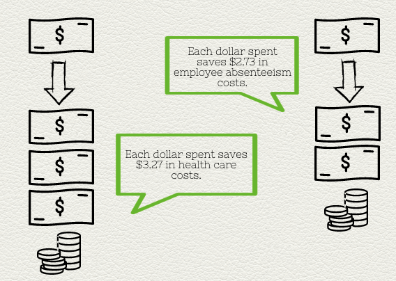
This can be difficult, too. Some of the data that I found was hard to show visually. Sometimes, you’ll be able to use something as simple as a pie chart or bar graph. I wasn’t that lucky, so I had to get creative. Here’s a couple screenshots of what I did:

I created each of these using graphics on the site I used (called Piktochart) instead of a pre-made chart or graph.

step 3: design

You can learn all about basic design principles here. I’m no expert at it, but I had the most fun with this part. Once you finish the other two steps, it’s easy to create a simple and clean-cut infographic.

The last tip I have for you is to use your design to tell a story. It’s an abstract concept, and this was hard for me to do with my particular subject. To be honest, I’m not confident that I did this part well. However, it’s important to keep storytelling in mind while creating your infographic. People love stories, so if you can find some way to accomplish that in your design, then do so.