Yes, I did. And (spoiler alert) they’re not as easy as they look.
Last week I wrote a post about how important infographics can be for companies to communicate important pieces of boring data in a fun and creative way. If you’re interested, you can read that post here.
Today, I’m going to discuss my own experience with creating an infographic. I created this one for a class, so we’ll see how well I actually did after it’s graded… hehe.
Even though I know that my infographic skills are not the best out there, I learned a lot about the process of making one that I thought I could share with you.

The preliminary things that should establish before you continue on to the steps below include your topic and your target audience.
I’ll use mine as an example. I used my infographic to show how important corporate wellness is (for companies and employees), because, well, I care about wellness and I think that everyone would benefit from having more opportunities for wellness at work.
My target audience? Business owners. Why? They’re the only ones who can really make a change. I could have targeted employees, but the odds are that they can’t do much with this information.
STEP 1: Find your data
You want data from peer-reviewed articles with legit research. This would be a million times easier if you’re working for a company who has collected the data themselves.
It was hard to find data for my subject. There’s been plenty of research on it, but most scholarly articles require you to buy the report that has the information you need, and I’m a broke college student, so… That wasn’t happening.
I did a lot of digging. The best thing that I can tell you is to be specific in your Google searches. I narrowed down the data I wanted to find to three main things — increases in employee productivity, return on investments for companies who have wellness initiatives, and the decrease in employee health risks — and then googled those specifically. Only then was I able to find articles that worked.
step 2: make an outline
How are you going to make the data you found visually interesting? Think this through before starting your design. Throwing out a bunch of big numbers and adding a pretty color scheme won’t do the trick. You’ll need to find ways to make the data easy to understand in a visual format. It’s okay to use a couple big numbers, but try to limit that as much as possible.
This can be difficult, too. Some of the data that I found was hard to show visually. Sometimes, you’ll be able to use something as simple as a pie chart or bar graph. I wasn’t that lucky, so I had to get creative. Here’s a couple screenshots of what I did:
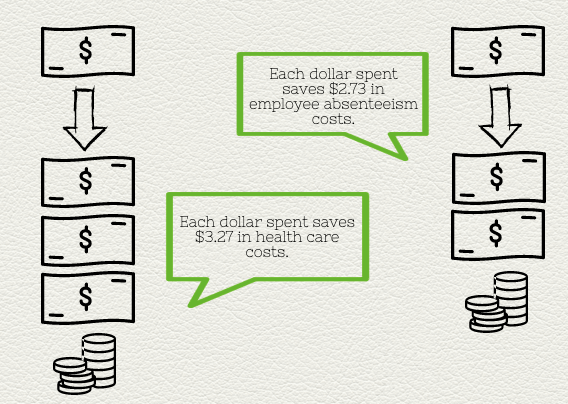

I created each of these using graphics on the site I used (called Piktochart) instead of a pre-made chart or graph.
step 3: design
You can learn all about basic design principles here. I’m no expert at it, but I had the most fun with this part. Once you finish the other two steps, it’s easy to create a simple and clean-cut infographic.
The last tip I have for you is to use your design to tell a story. It’s an abstract concept, and this was hard for me to do with my particular subject. To be honest, I’m not confident that I did this part well. However, it’s important to keep storytelling in mind while creating your infographic. People love stories, so if you can find some way to accomplish that in your design, then do so.
